How can we possibly pick which sites to share with you? Its like picking your favorite kid — or pasta!
Here is a sample of some of our latest work.
Remember, we create each site based on the CLIENT’S needs. So your site could (and should) look totally different depending on your style and objectives.
But, we didn’t want you to wander off without at least getting a few ideas of what is out there and what we are capable of.
Each of the thumbnails are clickable, so feel free to roam about the internet. Including, testing all of our sites in mobile (its part of our designs).
When you are ready, reach out to us and let’s make your online dream come true!
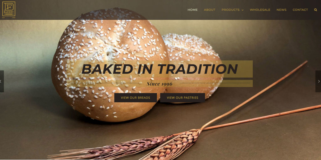
DF Bakery
 Because you can’t taste their breads online, DF Bakery needed a beautiful and functional site that gave users a taste of what they are about. And when you have breads and pastries that look this good, you can really let the photos do the talking.
And with a commercial baking capacity, they wanted to make sure everyone knew how to order their breads and pastries. Take a peak at their galleries to get a feel for what they (and Exposure One) offer.
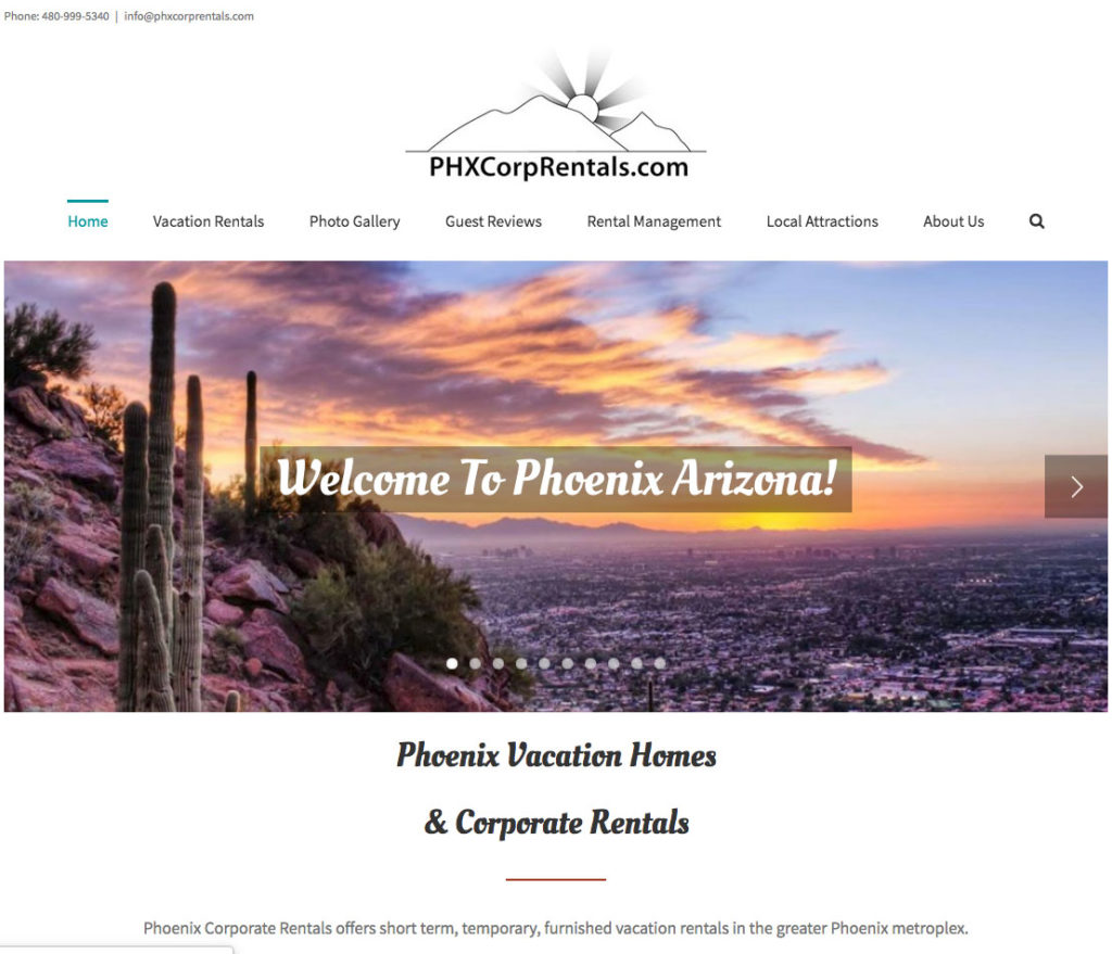
Phoenix Corporate Rentals
Offering business people and vacationers a “home away from home”, Phoenix Corporate Rentals wanted an elegant design that entices users to come stay with them.
So, we built them a site that showcases their beautiful homes and the Phoenix area — encouraging potential visitors to see what they are all about.
Advanced Septic Services
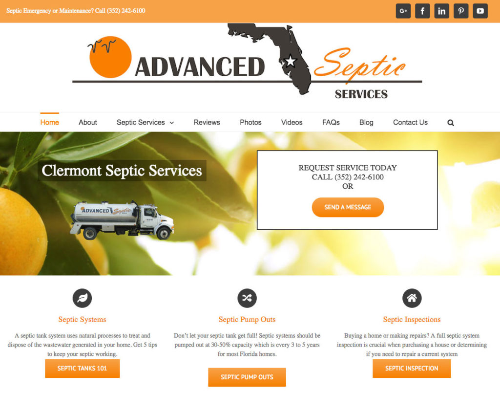 It may be a dirty business, but that doesn’t mean they wanted an old, cluttered site. Instead, Advanced Septic Services wanted a bright and modern site to take the stigma out of septic services.
With all of their services clearly listed and their professionalism highlighted, Advanced Septic Services makes sure to catch the eye of anyone in need of septic services.
SJ Healthcare Consulting
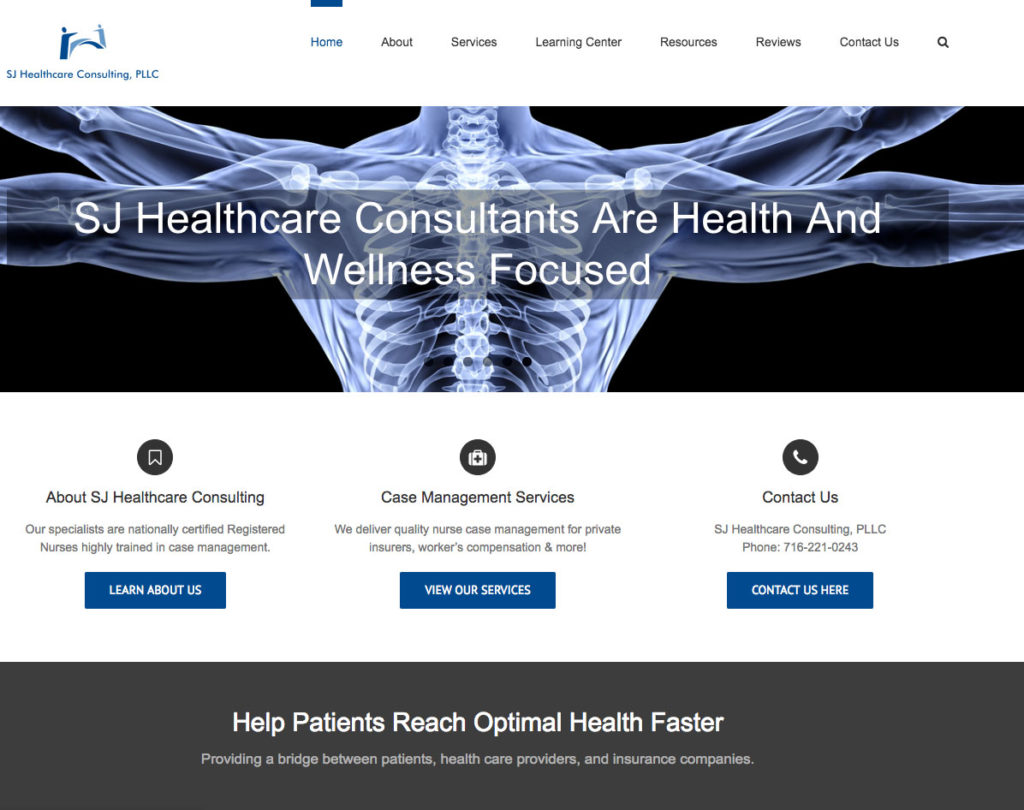 SJ Healthcare Consulting has a mission of helping you help your patients recover faster. Now that’s a mission we can all get behind!
With years of knowledge in the industry, we wanted to help users know that they were in good hands from the start. We opted for clean design in order to put the emphasis on what SJ Healthcare Consulting could do for them.
Equity First Funding
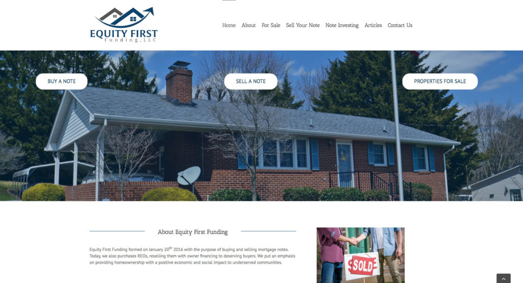
Equity First Funding wears many hats: Note Buyers, Property Sellers and Note Investors. So, they needed a site that offered all of that without becoming cluttered and confusing.
From the ability to begin the purchasing process of properties and assets online as well sell your mortgage note, the Equity First Funding website has it all.
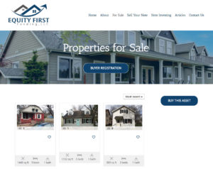
Better yet? It’s easy to use and navigate. Because if there is one thing we know its that if people can’t find what they are looking for, they won’t buy it. Interested in selling real estate online? Make sure to check out their property listing page to get some inspiration!
