When starting your business and setting up your marketing, one of the first things you think about is your branding. And that branding includes a great business logo.
With years in the business behind us, we have seen some truly great logos — and some truly terrible ones. And with so many clients asking us for insight and guidance when creating their logo, we wanted to share a few of the things we look for in a logo.

Requirements of a Great Business Logo
When creating your logo, whether through a local designer or freelance platforms like 99Designs and Fiverr, you want to make sure you get a logo that represents your business. And represents it well. So, during the creation process, there are few things you should keep in mind.
Logo Design Elements
Mixture of Words and Text
All text logos are a thing of the past. Instead, you want to incorporate some icon or design to accompany your business name when creating your logo.
Why?
Included in your branding these days is social media. The icons from your logo can help you create profile pictures and cover images that match your branding. Plus — all words are boring! You want to stand out, not blend into the background.
Pops of Color
While you will want to get an all-white and all-black version, your primary logo should have a bit of color. It adds life and interest to your business logo and makes it more memorable.
Additionally, most great website designs have a color scheme throughout the site. That color scheme is often taken from your business logo to keep with your “brand.”
Easy to Read Fonts
While it’s tempting to use fun fonts with plenty of flourishes, it can lead to a business logo that is difficult to read. So when it comes to the font of your business name, keep it professional and simple.
Design Balance
The most important part of your business logo? Your business name.
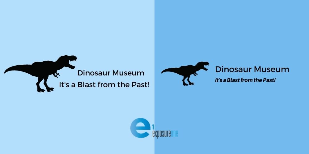
For that reason, any icons or taglines should complement your business name but shouldn’t be the main attraction. Let’s take a look at the below examples.
In Option A, the icon takes up 50% of the space, and the tagline is the same size as the business name. Unfortunately, this leaves potential clients less likely to remember your business name. In contrast, Option B offers an outstanding design balance with your business name as the most prominent element and the icon and tagline only adding to the design.

Required Logo Formats for Online Marketing
Now that you have your design dialed in let’s talk about what formats you need.
There is nothing worse than having a beautiful business website, but your logo is blurry. Luckily, that is easily avoidable. Most web designers will ask for the logo in the following formats:
- .png on a transparent background – great for using your logo on a colored background or image
- .jpg – can be compressed to the smallest size, great for on-page design and printable designs
- source file – either the .ai or .psd files, giving web and graphic designers access to all available formats
- vector file – great for if you’re looking to use your logo in print advertising or business cards.
You will also want to get a few different variations of your logo. Many designers will offer these variations; you just need to ask.
- Color/Standard Logo Version
- All-White Version
- All-Black Version
- The Icon in Color and Words in All-White (or a different mixture of color and black/white).
Taking Your Business Online
Great business logos are unique, relevant, and match your overall branding. And they are a required asset for a great business website.
Ready to move forward with taking your business online? Exposure One offers affordable web design and social media management. Reach out today to get started and to get your business found online!